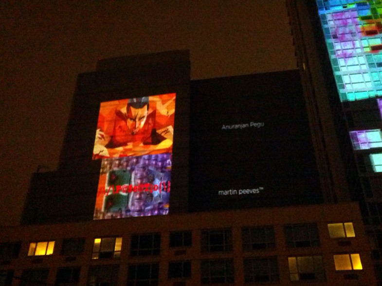
Last year (2013), in October, some of my work was shown in a group exhibition in Long Island City at the See|Me gallery. One of the works was projected on a building as well while the rest were shown on a screen inside the gallery.

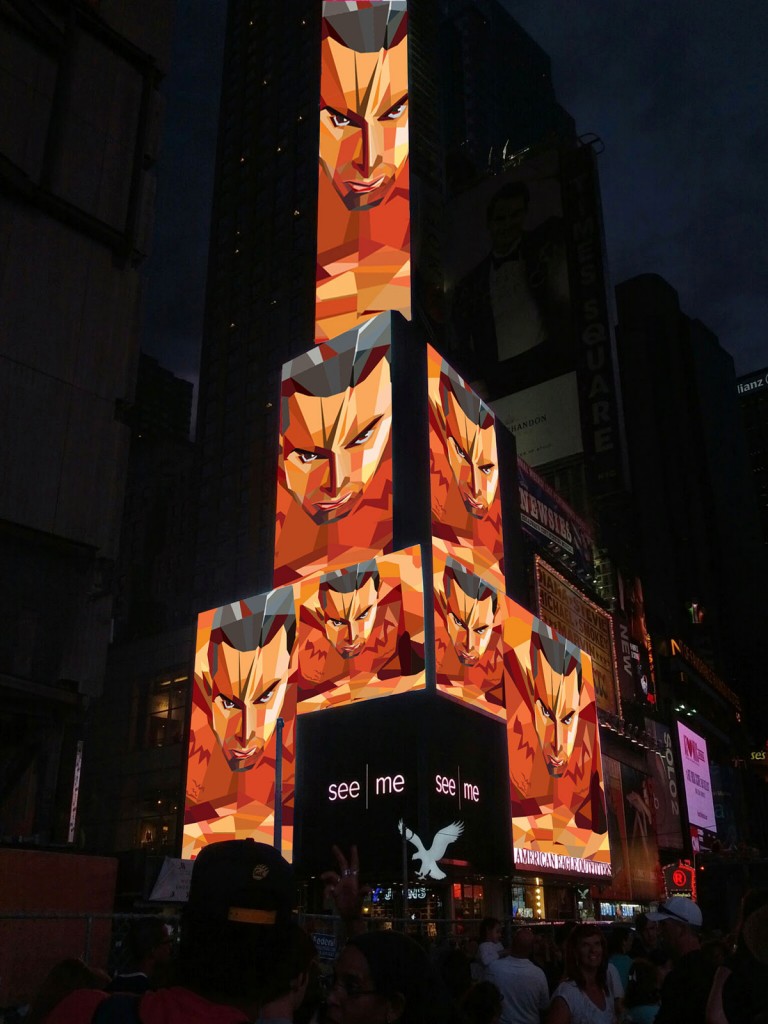
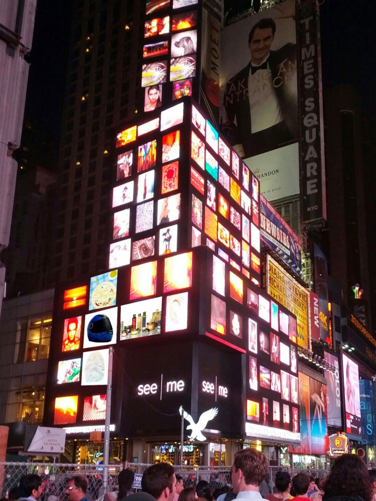
On July 28th 2014, in a group exhibition, a few additional works were also displayed in Times Square in NYC!! The mall graphics was the centerpiece but also shown were the helmet graphics, the poster-postcards, the book cover and the acclaimed Forest Essentials packaging. The last one is a major one because a junior designer in India was falsely claiming this design to be her concept on Behance and despite being asked to take it down, she hasn’t. By showcasing this work on the world’s largest billboard, it has been affirmation of the hard work that I and Manav put into this project.


iTokri is a store based in Pune, India. It is starting its online operations and has conceptualized a space called “69”- where people from different walks of life get together, interact and form a unique social network. The poster is illustrated in an “Indian” style, taking elements from local “landmarks” (e.g. a famous bakery, a mystical sage, a biker etc) and also from the kind of activities that the space would promote (e.g. poetry reading, music performances, movie screenings, photography etc)
The Maids’ Company is a philanthropic firm with a not-for-profit business model- it provides professional housekeeping services while empowering and bringing dignity to domestic workers. It needed an identity and visual communication that spoke to a relatively younger professional audience but was direct and effective at the same time. I refined a rough draft of the logo and designed stationery, brochures, posters and a website.
See here: http://themaidscompany.com/
Self promotional postcards cut out of a poster talking about my ideas on branding. The poster cuts up into nine ready-to-mail postcards, each carrying a unique message about branding and corresponds to a related message on the other side (the face of the postcard). The illustration style is very unique and something that I had developed for AT&T while I was working at Interbrand- detailed yet minimal.
Printed with silk-screen and very limited pieces available on request.

A conceptual poster for the New York Halloween Parade. The main theme was about how New Yorkers leave their inhibitions at home and bring out their “wild” side during the famous Halloween parade. The wild ‘beast’ emerging out of a man in a suit stresses this point. On closer look, the man’s silhouette is actually the skyline of the city that exists along the route of the parade. The beast is metaphor for several things including the historical implications of how the event had begun as an artist’s parade that developed into a parade celebrating alternate sexuality and which had later degenerated into a commercial marketing exercise.
Hand-drawn illustration and type, and printed with silk-screen, every print is different with limited prints still available on request.

The poster was design after building the concept and publicity for a film & rock festival in the Marshall Islands. The theme was about the environment and fighting global warming. The significance lies in the fact that the Marshall Islands would be the first islands to go under the ocean if global warming becomes a reality and the sea levels rise worldwide. The stars in the posters are based on the geographical cluster of the actual islands that are “in focus” for the event. The islands are known for the beautiful rainbows (called “jemeliwut” in the native language) and since rainbows signify hope, the name was chosen to brand the festival. The aim was to publicize the cause and generate revenue for Marshall Islands to help it prepare for any calamity. Quite distinct in layout, it’s hard to miss anywhere on the street, subway, building or just about anywhere!
