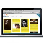
The Forest Essentials project that was done between 2011 and 2012 has finally been published in thedieline! The massively talented Manav Sachdev deserves a big round of applause and I can give a pat on my own back too! 🙂 Good to see our work up there after such a long wait!
Check it out here: http://bit.ly/GDWqqp
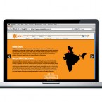
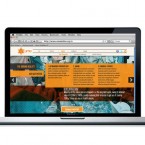
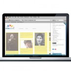
Urban Mahila & Mazdoor Alliance (UMA) is a membership based organisation of urban poor women workers in northern India. It provides services and solutions to improve the lives of its members in a productive and wholesome manner. s a non-governmental organization, it depends mostly on funding and needed a website to target potential investors and donors. The main aim was to highlight the work that they do in a professional manner.
The website had to stand because there are many similar organizations looking for sponsorship. The responsive design was worked around a content-management system using the best of WordPress and HTML. Nifty features include the use of parallax sliding, image scaling, in-page tabs and key-based navigation.
See more here
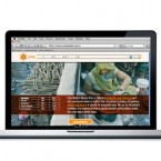
CuraSquare is a online space to connect creatives from different disciplines with a primary focus on film makers. It has been conceived as a website where the members will share articles, connect with each other, post jobs/events and use it as a general resource related to their fields. The content is user-generated- which means that the posts that show up are from the members of the website- not just from the administrators. The design had to look like a proper magazine-type website and not like a web forum. This made it imperative to use WordPress as the base for the CMS.
A wordpress template was used and modified heavily. Apart from a new color scheme and menus, other modifications include changing layouts of pages, setting up registration forms, options for login, options for comments, options to link videos, building profiles, communicating with other users, setting up mailboxes and posting events among others.
Check it out here
Forest Essentials makes premium Ayurvedic beauty products and it needed to reposition itself in a fast growing segment. The redesign concept was inspired by the exquisite tradition of miniature art of India that was patronized by royal Mughal & Rajput families. Ingredients were illustrated individually by hand and were assigned specific colors that helped in shelf placement & product recognition. The direction was a big step away from the generic and kitschy pattern-based designs to a more focused and integrated approach. While I did the concept & design, the illustrations were done by the talented Manav Sachdev.
The Maids’ Company is a philanthropic firm with a not-for-profit business model- it provides professional housekeeping services while empowering and bringing dignity to domestic workers. It needed an identity and visual communication that spoke to a relatively younger professional audience but was direct and effective at the same time. I refined a rough draft of the logo and designed stationery, brochures, posters and a website.
See here: http://themaidscompany.com/

Logo for Indian fashion designer Abhishek Gupta. The mark is inspired from the designer’s work which consists of a lot of handwork and traditional Indian weaving techniques mixed with modern designs. Also serving as inspiration is the interior of the store that is replete with a lot of fine line work of metal exuding a minimal and classy look. The interwoven letters of the modified typeface stands apart in the crowd of straight, untouched and uppercase type-based fashion labels.
Rock A Bella launched in November 2010 in New Delhi. A boutique promoting bohemian chic fashion so the branding had to be feminine yet quirky- from the logo to the shopping bags to the bill book.
Rock A Bella, a new fashion boutique, catering to the fashionable ‘young’ women of New Delhi, opened up recently. Through Green Goose studio, I did the branding and all further applications. The store reflects the vision of its owner who has a taste for the vintage and the bohemian- chic with a bit of edge and mildly whimsical at the same time. The entire branding exercise included package design, indulgent illustrations and quirky combinations to bring the whole thing alive.
Collateral includes the usual suspects- business cards, letterheads, envelopes, folders, stickers, cd labels, cd covers, shopping bags, garment bags, hang tags, labels, coasters, bill-books, etc. Watch this space for update on more pictures and other related stuff.
These graphic illustrations were developed for a upcoming mall in Mumbai that is billed as the largest mall in India till date. Spanning more than a kilometer of space on each floor, there are 7 atriums in between various sections VADS, a interior design firm, was assigned the job of developing way finding signage and developing distinct visual language on these atriums.
I developed many concepts and this was one of them. The atriums would be based on different themes related to Mumbai (e.g. Bollywood, the sea, cricket, monuments etc). The illustration style chosen was bold and distinct that would stand apart from all the other malls. Each atrium was color coded and every floor had a different visual related to the same theme. Apart from standing out, these distinct atriums become part of the way finding process for both, planners and visitors.
Pepsi India’s new tag line for 2010 is “Youngistaan Ka Wow” (The Wow of ‘Youngistaan’, the proverbial land of the young). For their visual language, I introduced a palette of young, bright colors with big and bold typography, unprecedented for Pepsi (and most companies) in India. The new look ties in with the North American campaign by Pepsi with its own distinct local flavor.
The same language has been carried into all applications including a simple yet innovative and interactive lookbook designed to outline the new brand guidelines for 2010. Applications range from posters to websites to massive billboards to special edition products like bowling pins. There were celebrity and product photo-shoots combined with continuous interaction with clients, studio personnel, vendors, printers etc. The look continues to find expression in other campaigns and heralds a new era for Pepsi in India.
Campaign executed in JWT Delhi under creative supervision of Sumati Singh and Soumitra Karnik.
