My work to be projected on a New York skyscraper in a group exhibition!

Yes, its true- my work will be up for about 10 odd minutes, projected on a skyscraper in NYC this saturday at around 10:10 pm. For more details see here: https://www.see.me/rising

Please join me if you can!

Forest Essential work finally features in thedieline!

The Forest Essentials project that was done between 2011 and 2012 has finally been published in thedieline! The massively talented Manav Sachdev deserves a big round of applause and I can give a pat on my own back too! 🙂 Good to see our work up there after such a long wait!

Check it out here: http://bit.ly/GDWqqp 
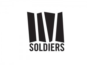
 

IV Soldiers


IV Soldiers is a studio space in Brooklyn for performances, meetings, lectures and an archive for the artistic community. The logo had to have a sense of boldness and character without being intimidating. It had to evoke a forward movement and dynamism- a reflection of the type of experimental art the space seeks to promote.

The solution was a fluid shape with the negative spaces forming the actual letters in the Roman IV. The bigger blocks of color was  retained to allow for larger space to be used during promotions- where it could carry photos, illustrations of just type, keeping the nature of the logo very dynamic and organic. While the mnemonic evokes the spirit of experimentation, the stability and strength is highlighted by the bold type used for “Soldiers”- a sense of balance in attempting to bridge two worlds.

BlueLotus Strategy Consulting branding

BlueLotus Strategy Consulting is a new consulting firm in India. It’s main USP is consultation services with the added expertise of technology. The logo unit emphasizes the idea of digital technology and this unique “package” by using a three-dimensional box made out of dots while the lotus (signifier of  knowledge and growth, auspicious in Indian culture) is represented as a modern simplified form that reflects the forward looking mindset of the company with strong roots to tradition.
In addition, the company created a suite of software products. The logos for these had to have a visual resemblance to the parent company’s logo. The logos were created using relevant & recognizable visual symbols.

iTokri Poster

iTokri is a store based in Pune, India. It is starting its online operations and has conceptualized a space called “69”- where people from different walks of life get together, interact and form a unique social network. The poster is illustrated in an “Indian” style, taking elements from local “landmarks” (e.g. a famous bakery, a mystical sage, a biker etc) and also from the kind of activities that the space would promote (e.g. poetry reading, music performances, movie screenings, photography etc)

Anjellic Delights


A logo for a pastry shop. A fat little dough devil holding the essential tool of any bakery- the whisk- is a playful touch. It refers to how sinful the baked goods are- as if the devil himself is making these to tempt people into submission. Customized type evoking icing-typography complements the dough-devil to give a friendly look to the entire logo.

Just in: new helmet design!

It’s a new year and that means it’s time for a new helmet. The first experiment with a polycarbonate helmet meant that I could only use water-based colors since thinner based paints could affect the integrity of the helmet. Used pearlized airbrush colors with brushes that gave that unique shimmering effect- seen best in the bright sun. Coated with a gloss urethane coat. The next project will be full airbrushing but without stencils-the feel of a freehand is too much to give up! The orange not only highlights my brand color but suitably matches my latest bike- a KTM!

Shoe concept


Shoes designed for Wrangler that takes inspiration from the classic sneaker style with a contemporary twist to it. Modern materials adorn the entire shoe- waterproof kevlar-reinforced fabric, anti-microbial interiors, unique collar system to transform the shoe between a mid-ankle and low-ankle- while upping the fashion quotient with its unique style.

e-Waste Recycling B2B Campaign

Campaign concept for a e-waste recycling firm in India. The campaign was a B2B exercise to create awareness of the recycling services provided by Attero by highlighting the monumentality of the problem and possibilities borne out of it. Also important to highlight was the idea of recycling e-waste as a positive process rather than a “negative” or subtractive one.

Happy 2011!

For those who missed out, this is the year of the Rabbit- so have a jolly hopping time!

pagetop