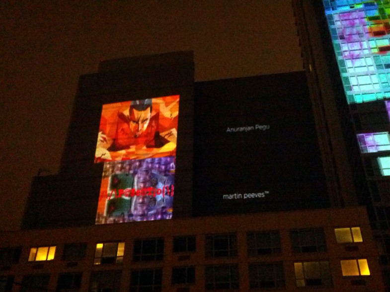
Last year (2013), in October, some of my work was shown in a group exhibition in Long Island City at the See|Me gallery. One of the works was projected on a building as well while the rest were shown on a screen inside the gallery.
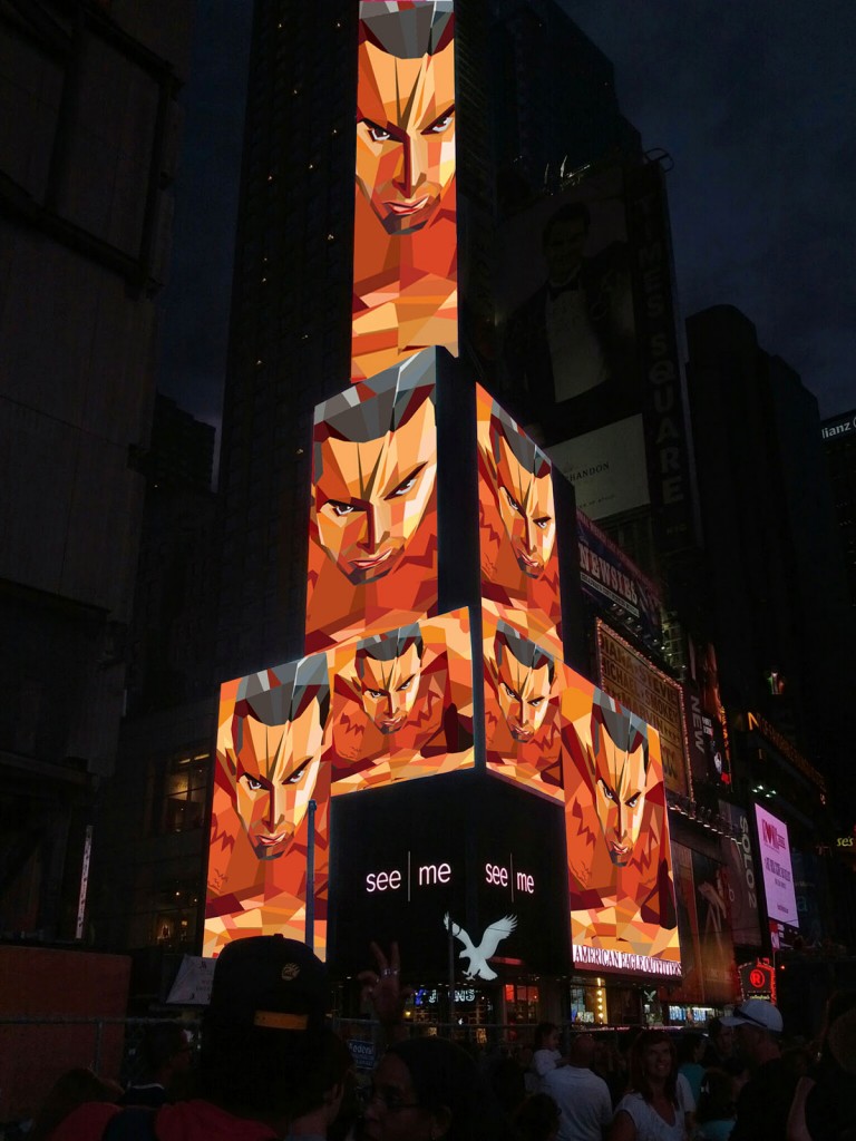
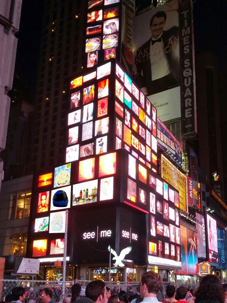
On July 28th 2014, in a group exhibition, a few additional works were also displayed in Times Square in NYC!! The mall graphics was the centerpiece but also shown were the helmet graphics, the poster-postcards, the book cover and the acclaimed Forest Essentials packaging. The last one is a major one because a junior designer in India was falsely claiming this design to be her concept on Behance and despite being asked to take it down, she hasn’t. By showcasing this work on the world’s largest billboard, it has been affirmation of the hard work that I and Manav put into this project.
Yes, its true- my work will be up for about 10 odd minutes, projected on a skyscraper in NYC this saturday at around 10:10 pm. For more details see here: https://www.see.me/rising
Please join me if you can!
The Forest Essentials project that was done between 2011 and 2012 has finally been published in thedieline! The massively talented Manav Sachdev deserves a big round of applause and I can give a pat on my own back too! 🙂 Good to see our work up there after such a long wait!
Check it out here: http://bit.ly/GDWqqp
Today Listserve sent out my mail to 20,000+ subscribers all around the world. To those who made it till here, thank you for visiting! I hope my short mail inspired or hit a chord in your hearts about being free and truly happy. I started “exploring” with bicycles and the desire to see more and go further made me switch to motorcycles that took me far but ironically brought me closer to where I started from. Traveling happy (not your rushed, super-planned itineraries) is what I would encourage and I feel there is nothing better than a motorcycle. Riding everyday to work has always been therapeutic that takes away any tiredness or stress from work. I would strongly suggest that you try it too- considering, in a car even I am more prone to have road rage! At least one research has also proven that motorcyclists actually reach a “different level” when they are riding.
So what am I really trying to say? I am just saying that achieving happiness is pretty simple. People often confuse happiness with winning, owning or mastering things but once you ride, your feelings are like that of your ten-year old self riding a bicycle around the neighborhood- pure, free, simple and blissful. There are many ways to get there but this is the way I have found. A clutter-free, uncomplicated and a highly simplified way.
I invite you to ask me anything you like- about the motorcycle trip, about my work, about riding together in NYC- anything at all. And I would love to hear your stories of how you found your happiness. Thank you again for reading and remember, happiness is simple. 🙂
The link to the post is here: http://thelistserveblog.blogspot.com/2013/06/one-motorcycle-trip.html and here: http://www.servethelist.com/2013/06/17/one-motorcycle-trip/
The blog of the motorcycle trip mentioned in the email is here: http://thepointistotravel.blogspot.com/
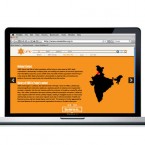
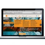
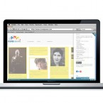
Urban Mahila & Mazdoor Alliance (UMA) is a membership based organisation of urban poor women workers in northern India. It provides services and solutions to improve the lives of its members in a productive and wholesome manner. s a non-governmental organization, it depends mostly on funding and needed a website to target potential investors and donors. The main aim was to highlight the work that they do in a professional manner.
The website had to stand because there are many similar organizations looking for sponsorship. The responsive design was worked around a content-management system using the best of WordPress and HTML. Nifty features include the use of parallax sliding, image scaling, in-page tabs and key-based navigation.
See more here
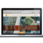
CuraSquare is a online space to connect creatives from different disciplines with a primary focus on film makers. It has been conceived as a website where the members will share articles, connect with each other, post jobs/events and use it as a general resource related to their fields. The content is user-generated- which means that the posts that show up are from the members of the website- not just from the administrators. The design had to look like a proper magazine-type website and not like a web forum. This made it imperative to use WordPress as the base for the CMS.
A wordpress template was used and modified heavily. Apart from a new color scheme and menus, other modifications include changing layouts of pages, setting up registration forms, options for login, options for comments, options to link videos, building profiles, communicating with other users, setting up mailboxes and posting events among others.
Check it out here

The Brooklyn International Performance Art Festival needed a new logo. They wanted to convert their old type-driven logo to something that expresses the main notion of performance art- “it is with a human body , expressing a concept through actions in space”. It had to be inspirational, new, confident, professional, and identifiable. It had to represent the massive growth of performance art in Brooklyn overflowing into a performance festival.
The solid letter “B” denotes the performance space and the burst suggests the sense of action and the energy that flows outward from within that space. It acquires the dynamism that performance art is imbued with. The new branding maintains a link with the older logo by using the latter’s color and the typographic family.

IV Soldiers is a studio space in Brooklyn for performances, meetings, lectures and an archive for the artistic community. The logo had to have a sense of boldness and character without being intimidating. It had to evoke a forward movement and dynamism- a reflection of the type of experimental art the space seeks to promote.
The solution was a fluid shape with the negative spaces forming the actual letters in the Roman IV. The bigger blocks of color was retained to allow for larger space to be used during promotions- where it could carry photos, illustrations of just type, keeping the nature of the logo very dynamic and organic. While the mnemonic evokes the spirit of experimentation, the stability and strength is highlighted by the bold type used for “Soldiers”- a sense of balance in attempting to bridge two worlds.