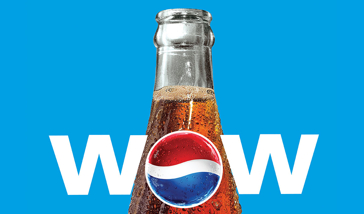
Pepsi India’s new tag line for 2010 was “Youngistaan Ka Wow” (The Wow of ‘Youngistaan’, the proverbial land of the young). I used a palette of young, bright colors with big and bold typography, unprecedented for Pepsi in India. The same language has been carried into all applications including a interactive lookbook designed to outline […]
Branding
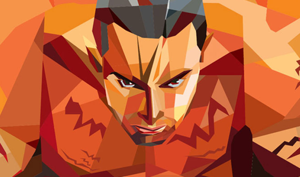
These graphic illustrations were developed for a upcoming mall in Mumbai that is billed as the largest mall in India till date. Working with VADS, a interior design firm designing the way-finding signage, I developed a distinct visual language for each of the 7 atriums within the mall.In this concept, the atriums would be based […]
Design Collab is born out of the collaboration of two design studios in India. The service of this studio extends to architecture, interior, master planning and landscape. I reworked on the logo to make the “collaboration” aspect come out more with the addition of the ‘+’ in the infinity symbol. In the branding system, every […]
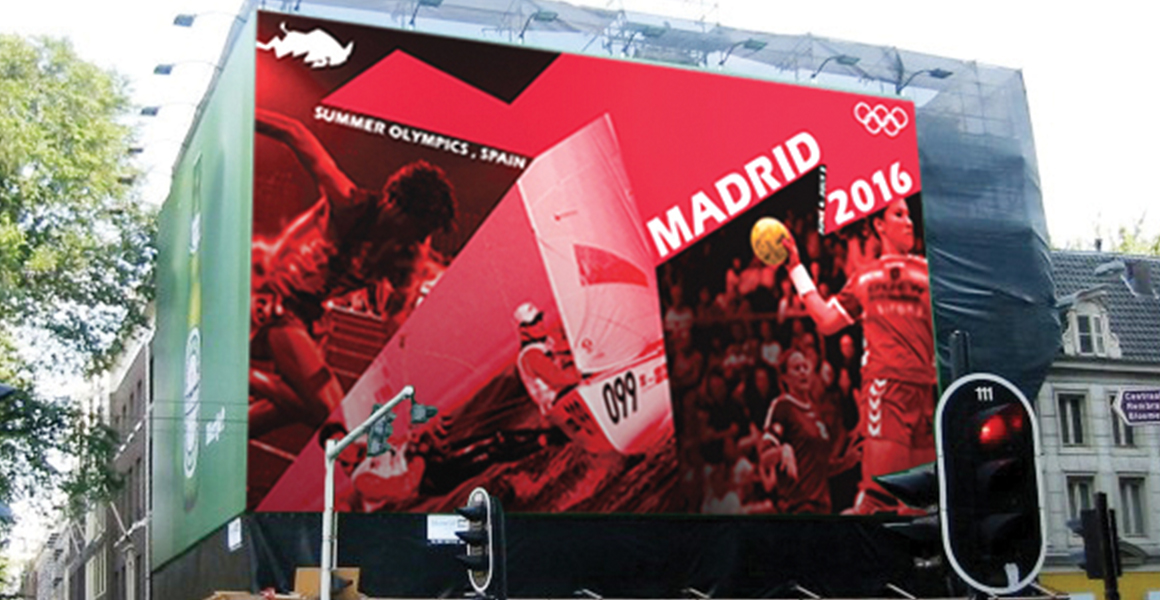
A conceptual branding project for the 2016 Olympics to be hypothetically held in the city of Madrid, Spain (unfortunately, Spain lost the bid). Special event icons and a unique three-in-one poster were part of the collateral developed for the event. The inspiration of the main logo came from the virility and strength associated with bullfighting (without glorifying […]
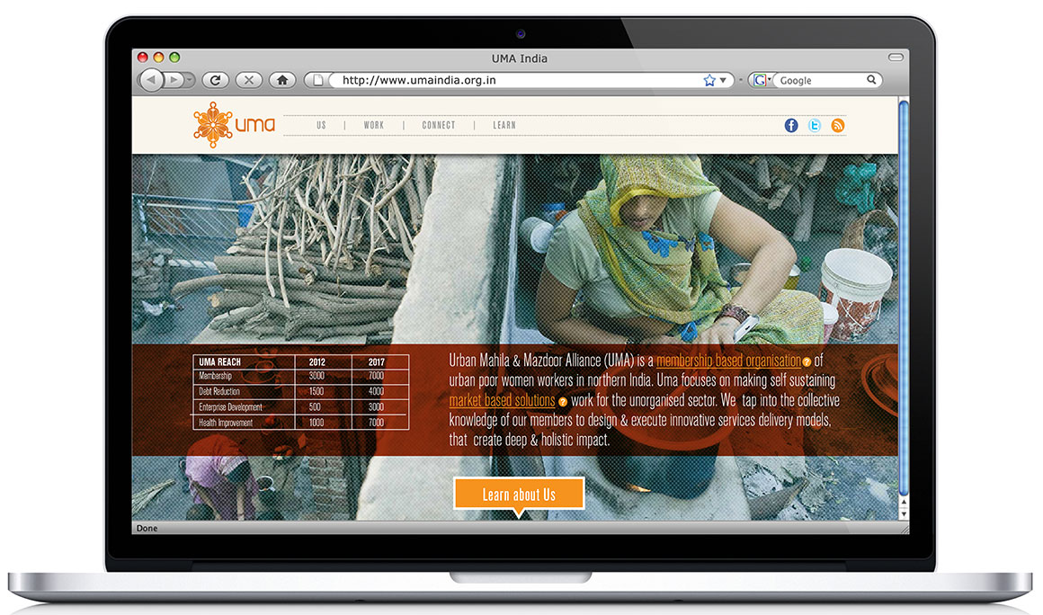
Urban Mahila & Mazdoor Alliance (UMA) is a membership based organisation of urban poor women workers in northern India. It provides services and solutions to improve the lives of its members in a productive and wholesome manner. As a non-governmental organization, it depends mostly on funding and needed a website to target potential investors and […]
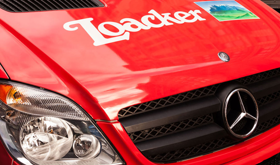
Loacker is an Italian cookie company that wanted to establish itself in the US market after officially launching and hired PM+Co as their agency on record. We partnered with social media specialists and event organizers to launch a 360 campaign. This included eye-catching graphics on the packaging, on-field promotions like brochures, door hangers, coffee cup sleeves, catalogs and big […]
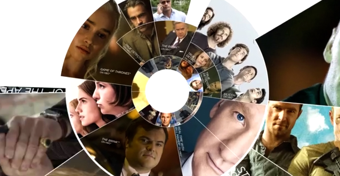
Designed this award-winning look for HBO’s 2015 summer promotional campaign. Concentric circles are used to show the breadth and depth of HBO’s programing that not only changed the traditionally “dark” aesthetic of previous campaigns, it translated very well into digital and video. Deliverable included direct mail, ad slicks, free standing inserts, web banners and emails.
Bakery logo playing on the name of the owner and her sinfully sweet creations.
The Maids’ Company is a philanthropic organization that provides professional housekeeping services while empowering and bringing dignity to domestic workers. A identity and visual communication was created that spoke to a relatively younger professional audience but was direct and effective at the same time.
The India Shelter Finance Corporation (ISFC) is a micro-finance company in India who provide loans to those employed in the unorganized sector of the Indian economy for building new homes or extending existing homes. The main challenge in this branding program was that a vast majority of these professionals are illiterate and uneducated and consequently do not respond to […]