IV Soldiers is a studio space in Brooklyn for performances, meetings, lectures and an archive for the artistic community. The logo had to have a sense of boldness and character without being intimidating. It had to evoke a forward movement and dynamism- a reflection of the type of experimental art the space seeks to promote.
The solution was a fluid shape with the negative spaces forming the actual letters in the Roman IV. The bigger blocks of color was retained to allow for larger space to be used during promotions- where it could carry photos, illustrations of just type, keeping the nature of the logo very dynamic and organic. While the mnemonic evokes the spirit of experimentation, the stability and strength is highlighted by the bold type used for “Soldiers”- a sense of balance in attempting to bridge two worlds.

Kali Billi (=Black Cat) is a new technology/digital/UI oriented company based in New Delhi, India. The name is inspired from the association of black cats with superstition and magic in various cultures. Hiding the letters within the form of a “magically appearing” black cat works on the same notion of surprise and delight that the company seeks to create with its products.

A logo for a pastry shop. A fat little dough devil holding the essential tool of any bakery- the whisk- is a playful touch. It refers to how sinful the baked goods are- as if the devil himself is making these to tempt people into submission. Customized type evoking icing-typography complements the dough-devil to give a friendly look to the entire logo.

Book cover for a diet book by a well-known Indian author/dietitian. The book was about healthy eating with “everyday foods”. The aim was to use a distinctive style to make it stand out in any book shelf in a crowd of diet books.

Logo for Indian fashion designer Abhishek Gupta. The mark is inspired from the designer’s work which consists of a lot of handwork and traditional Indian weaving techniques mixed with modern designs. Also serving as inspiration is the interior of the store that is replete with a lot of fine line work of metal exuding a minimal and classy look. The interwoven letters of the modified typeface stands apart in the crowd of straight, untouched and uppercase type-based fashion labels.

Pau Wow is the shoe label by designer Pia Pauro. Designed to be elegant party wear with the sensibility of Boho chic, her shoes carry her personality prominently. The logo accentuates the whimsical nature of the brand by using type that is intertwined with a shoe that characterizes the boldness of the entire line on offer.

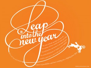
For those who missed out, this is the year of the Rabbit- so have a jolly hopping time!
