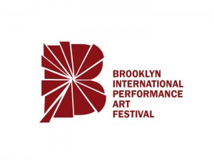
BIPAF logo
The Brooklyn International Performance Art Festival needed a new logo. They wanted to convert their old type-driven logo to something that expresses the main notion of performance art- “it is with a human body , expressing a concept through actions in space”. It had to be inspirational, new, confident, professional, and identifiable. It had to represent the massive growth of performance art in Brooklyn overflowing into a performance festival.
The solid letter “B” denotes the performance space and the burst suggests the sense of action and the energy that flows outward from within that space. It acquires the dynamism that performance art is imbued with. The new branding maintains a link with the older logo by using the latter’s color and the typographic family.
TrackBack URL :
