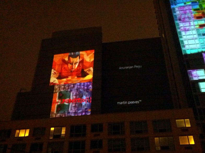
Last year (2013), in October, some of my work was shown in a group exhibition in Long Island City at the See|Me gallery. One of the works was projected on a building as well while the rest were shown on a screen inside the gallery.

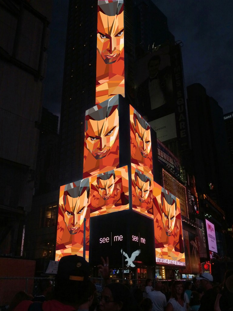
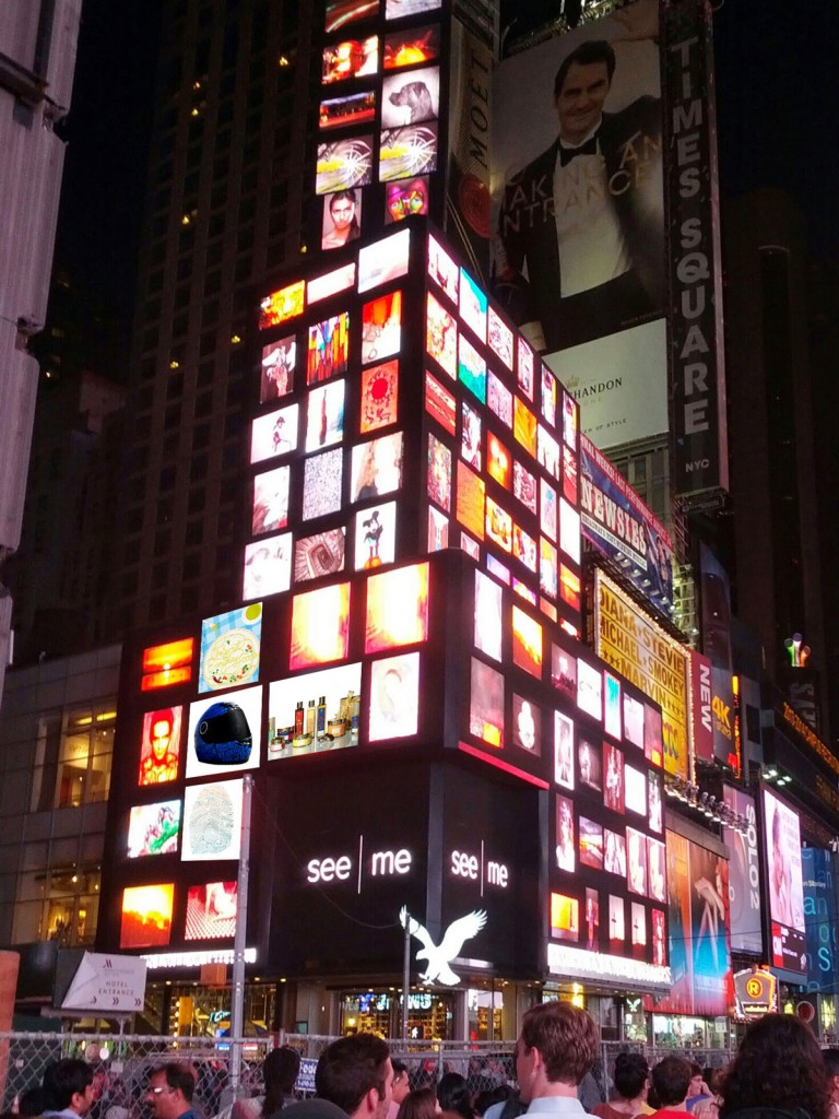
On July 28th 2014, in a group exhibition, a few additional works were also displayed in Times Square in NYC!! The mall graphics was the centerpiece but also shown were the helmet graphics, the poster-postcards, the book cover and the acclaimed Forest Essentials packaging. The last one is a major one because a junior designer in India was falsely claiming this design to be her concept on Behance and despite being asked to take it down, she hasn’t. By showcasing this work on the world’s largest billboard, it has been affirmation of the hard work that I and Manav put into this project.


Yes, its true- my work will be up for about 10 odd minutes, projected on a skyscraper in NYC this saturday at around 10:10 pm. For more details see here: https://www.see.me/rising
Please join me if you can!
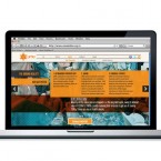
Urban Mahila & Mazdoor Alliance (UMA) is a membership based organisation of urban poor women workers in northern India. It provides services and solutions to improve the lives of its members in a productive and wholesome manner. s a non-governmental organization, it depends mostly on funding and needed a website to target potential investors and donors. The main aim was to highlight the work that they do in a professional manner.
The website had to stand because there are many similar organizations looking for sponsorship. The responsive design was worked around a content-management system using the best of WordPress and HTML. Nifty features include the use of parallax sliding, image scaling, in-page tabs and key-based navigation.
See more here

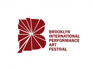
The Brooklyn International Performance Art Festival needed a new logo. They wanted to convert their old type-driven logo to something that expresses the main notion of performance art- “it is with a human body , expressing a concept through actions in space”. It had to be inspirational, new, confident, professional, and identifiable. It had to represent the massive growth of performance art in Brooklyn overflowing into a performance festival.
The solid letter “B” denotes the performance space and the burst suggests the sense of action and the energy that flows outward from within that space. It acquires the dynamism that performance art is imbued with. The new branding maintains a link with the older logo by using the latter’s color and the typographic family.
