The Brooklyn International Performance Art Festival needed a new logo. They wanted to convert their old type-driven logo to something that expresses the main notion of performance art- “it is with a human body , expressing a concept through actions in space”. It had to be inspirational, new, confident, professional, and identifiable. It had to represent the massive growth of performance art in Brooklyn overflowing into a performance festival.
The solid letter “B” denotes the performance space and the burst suggests the sense of action and the energy that flows outward from within that space. It acquires the dynamism that performance art is imbued with. The new branding maintains a link with the older logo by using the latter’s color and the typographic family.

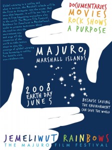
The poster was design after building the concept and publicity for a film & rock festival in the Marshall Islands. The theme was about the environment and fighting global warming. The significance lies in the fact that the Marshall Islands would be the first islands to go under the ocean if global warming becomes a reality and the sea levels rise worldwide. The stars in the posters are based on the geographical cluster of the actual islands that are “in focus” for the event. The islands are known for the beautiful rainbows (called “jemeliwut” in the native language) and since rainbows signify hope, the name was chosen to brand the festival. The aim was to publicize the cause and generate revenue for Marshall Islands to help it prepare for any calamity. Quite distinct in layout, it’s hard to miss anywhere on the street, subway, building or just about anywhere!

