Yes, its true- my work will be up for about 10 odd minutes, projected on a skyscraper in NYC this saturday at around 10:10 pm. For more details see here: https://www.see.me/rising
Please join me if you can!

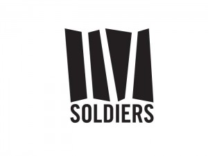
IV Soldiers is a studio space in Brooklyn for performances, meetings, lectures and an archive for the artistic community. The logo had to have a sense of boldness and character without being intimidating. It had to evoke a forward movement and dynamism- a reflection of the type of experimental art the space seeks to promote.
The solution was a fluid shape with the negative spaces forming the actual letters in the Roman IV. The bigger blocks of color was retained to allow for larger space to be used during promotions- where it could carry photos, illustrations of just type, keeping the nature of the logo very dynamic and organic. While the mnemonic evokes the spirit of experimentation, the stability and strength is highlighted by the bold type used for “Soldiers”- a sense of balance in attempting to bridge two worlds.

The contender: Rodeo 2.0, a shoe created for an online contest becomes one of the 5 favorite picks. Not bad for a graphic designer, eh? See here

